Winter League
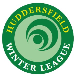
Following the recent poll among Winter League bowlers I indicated that a local bowler/printer had offered the services of a professional graphic designer to tweak our winning logo. I am grateful to PrintPod and Richard Haigh of Solo & Jones for their input. The fruits of their expertise are below on the right. The version you voted as your top choice from the six shortlisted logos is also included below on the left.
POLL WINNER PRO VERSION
It is only right that members should be asked again for their preference before we settle on one to serve us for the future. So a 48-hour vote is now underway. Just cast your vote for which you find the best-suited logo for our bowling league. Cast your vote below and then we can get this show on the road.
Poll closes at 2pm Monday.


I didn’t vote for the winner because I thought it was a bit unbalance, I might have a touch of OCD. Anyway, as much as I appreciate the “professionals” taking a look at it they haven’t alter it that much. I do think that having Winter League around the edge is better but the middle bit now seems “odd”, that’s my OCD kicking in again. I know we could talk about this till the cows come home but once it’s decided we are stuck with it. Does anybody else agree or am I being picky. I’ve had a think and the only thing I’ve come up with is to have a wood in the middle. In the end it’s not…